Styling the Inbox component
Learn how to style the pre built Inbox component
The Novu Inbox component is designed to be fully themeable and adaptable to your application’s visual language. All theming options are exposed through the appearance prop, which allows you to apply custom styles at different levels of control from predefined themes to component-level overrides.
The appearance prop supports the following keys:
baseTheme: Apply a predefined theme (for example, light or dark).variables: Define global styling properties (for example, colors, fonts).elements: Style individual UI components.icons: Replace default icons with custom ones.
Understand style injection
When rendered, the Inbox component automatically injects its styles into the <head> of the HTML document. If the component is rendered inside a shadow DOM, styles are scoped and injected into the shadow root instead.
This ensures that:
- Styles remain encapsulated and do not leak into global stylesheets
- No additional setup is required to manage scoped styling
Apply base theme
You can apply a predefined visual style to the entire Inbox UI by passing the baseTheme object inside the appearance prop. This is a quick way to implement a dark mode or any base look and feel without redefining every variable.
Novu currently provides a built-in dark theme, which you can import from @novu/react/themes.
Define global variables
You can override the default styles in the Inbox component by passing a variables object inside the appearance prop. This is an efficient way to apply broad visual changes with minimal configuration.
baseTheme and variables are provided, variables always take precedence over the base theme.List of available variables
| Prop | Type | Default |
|---|---|---|
borderRadius? | string | - |
fontSize? | string | - |
colorShadow? | string | - |
colorNeutral? | string | - |
colorCounterForeground? | string | - |
colorCounter? | string | - |
colorSecondaryForeground? | string | - |
colorSecondary? | string | - |
colorPrimaryForeground? | string | - |
colorPrimary? | string | - |
colorForeground? | string | - |
colorBackground? | string | - |
Style the Inbox UI elements
You can define styles for individual UI components within the Inbox UI by passing the elements object inside the appearance prop. Each key corresponds to a specific component, and the value can be either a style object or a set of CSS classes.
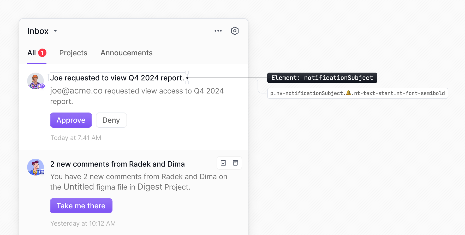
Here's a list of available elements that can be styled using the elements object in your appearance configuration:
Any selector that appears before the 🔔 emoji, can be targeted via the elements property in the appearance prop (stripping the nv- prefix). You can also use TS autocomplete to find the
available elements.
Using styles object
You can pass inline styles to individual elements using the elements object in the appearance prop. Each element can receive a style object directly.
Using Tailwind CSS
You can pass Tailwind CSS classes to specific elements using the elements object within the appearance prop.
Using CSS Modules
You can style the Inbox components using CSS Modules. First, define the styles in a .module.css file:
Then, import the CSS module into your component and apply the classes using the elements object in the appearance prop:
Replace default icons
You can replace all the default icons in the Inbox UI with custom icons from your preferred library, such as react-icons or Material Icons., to match your visual style using the' icons' key in the appearance prop.
For each icon you want to customize, provide a function that returns your custom icon as a React component.
List of customizable icons
Use these keys in the appearance.icons property to customize specific icons in the Inbox component:
| Icon Key | Description |
|---|---|
arrowDown | Down arrow used in drop-downs and expandable sections |
arrowDropDown | Drop-down arrow in menus and selectors |
arrowLeft | Left arrow used in pagination and navigation |
arrowRight | Right arrow used in pagination and navigation |
bell | Notification bell icon in the header |
chat | Chat channel icon in notification preferences |
check | Checkmark icon used for selected items |
clock | Date/time display for notifications |
cogs | Settings/preferences icon in the header |
dots | More options menu (three dots) in notification items |
email | Email channel icon in notification preferences |
inApp | In-app channel icon in notification preferences |
markAsArchived | Icon for archiving notifications |
markAsArchivedRead | Icon for marking notifications as archived and read |
markAsRead | Icon for marking notifications as read |
markAsUnread | Icon for marking notifications as unread |
markAsUnarchived | Icon for unarchiving notifications |
push | Push notification channel icon in preferences |
sms | SMS channel icon in notification preferences |
trash | Delete/remove icon for notifications |
unread | Indicator for unread notifications |
unsnooze | Icon for unsnoozed notifications |
You can inspect the Inbox component using your browser’s developer tools to discover icon keys. Icon elements have class names that start with nv- and include a 🖼️ emoji for easier identification. The part following nv- is the icon key. For example, an element with the class nv-cogs has the icon key cogs.